I can’t remember how I found out about “Inktober“, I think it was a fellow artist interning where I worked. After hearing about it from several people, I finally decided to give it a try in 2016. That first year I documented my journey on this blog. I took time to post my roughed pencil drawings, comment on what I chose to draw and list what pens used to ink the drawings. As I took on the challenge in the following years I found it harder and harder to make the time for the drawings, little lone time to post all of these extras on the blog.
My method has always been to, first, get inspired by the artists who already posted that days’ drawing and always to Google each days’ word to try and get ideas flowing. Once I get an idea, then I will almost always need reference photos and so I will then Google the references I need. Then it is time to sketch out my idea in pencil. Once I get the rough about how I want it, I come in with some type of fine liner and go over the image. Next I will do one of the following: I will use lines and cross hatching to shade the drawing first or I will go around with a heavier fine liner to “sculpt” my lines giving them more weight in some areas. Lastly I will erase my pencil lines before snapping a photo to post to Instagram.
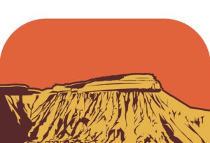
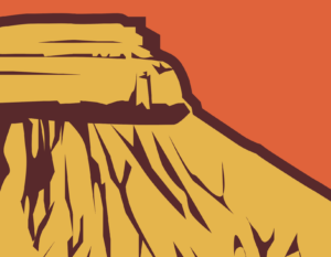
Listening to Two Steps From Hell on a run one day I wrote an epic story in head. This is a scene from the story. “One day Titus crested a mountain ridge and saw an endless valley he had to cross. His heart sank as dark clouds dropped snow. He entered a blizzard that was nearly impossible for him to trudge through. The further he entered it, the more lost he felt. After several days of pushing through deeper and deeper snow he slowed to a stop. He was cold, hungry, in the dark and completely lost. He realized, this is how he would die. He prayed to God. Within an hour some light made it possible to see miles through the falling snow. And that’s when he saw a lone mountain peak on the horizon. Not just any mountain peak, but the unique shape of something he’d seen in children’s books and works of art his entire life. This was Mora the Mountain!”
Artificial Intelligence’s Place in Art [reposted from my work blog]
If you’re not aware yet of the ways Artificial Intelligence is making inroads in just about every industry, you will be soon, because you’ve likely already come in contact with it. It’s personalizing your shopping, it’s helping your GPS navigation and it is curating your social media feeds.
A.I. Art
In recent years programmers and artists have used and improved upon “text-to-image” programs. Essentially they have created applications that allow users to enter in prompts that A.I. then uses to create unique images.
The following image was created using prompts such as “cartoon”, “backpacker”, “mascot”, and “logo”.
“EIUMMAAMAANNRRTS”?
These image generators have the vastness of the internet itself for image sources. They can then meld the source images into unique images that are beautiful and astounding. Finished images can range from simple cartoons to ultra realistic portraits.
This is an A.I. rendering of my self portrait done in DreamStudio.
This t-shirt design was generated in DreamStudio simply by typing in words like “mountain, western Colorado in the style of 8o’s synthwave art.”
Why Pay a Graphic Designer?
With the ability to create such beautiful art simply by typing prompts, you may be wondering “Why would I pay a graphic designer to create art for me?” The answer is, customization. Artificial Intelligence, though impressive, will never be able to tweak the designs to fit your unique needs. If you want a view of Independence Monument from the south with wavy text on the bottom, you’re going to be hard pressed to get it just the way you envision it without talking to a human being. Furthermore, A.I. has a difficult time with some more complex ideas like perspective and more intricate things like machine parts or human bodies.
You’ll notice A.I. for some reason gave this character about 11 fingers on his right hand and added a floating mountain peak above him among other issues.
Even if you generated this image yourself and you were happy with the character, the colors and the basic layout, you would still need someone with some graphic art experience to tidy up the problems.
How Can We Use A.I. for Artistic Endeavors?
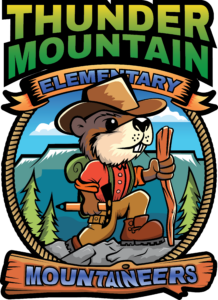
If A.I. can’t create a finalized, useable image or logo for you, then is there any reason to use it at all? We at Merge2Media have found that using A.I. to help in the brainstorming phase to very helpful. Recently we worked on developing the new logo for Thunder Mountain Elementary’s new mascot, the Mountaineers. This is when we had A.I. generated the aforementioned cartoon backpacker logos. The gave us a great launching point to come up with this more finalized artwork:
Although this wasn’t the logo the school chose to move forward with, this would suffice as a finalized illustrative logo or badge.
The sky is the limit when it comes to your graphics, illustrative or logo needs and with the aide of A.I. art generators, we can more quickly provide you with whatever you may be dreaming of for your next project. Contact Merge2Media to get started on your next t-shirt, mug, poster or logo idea!
Your brand plays a major role in why customers and potential customers choose you over your competition. Your logo is the face of your brand and can communicate, in an instant, your company’s qualities, mission and trustworthiness to those customers. Over time, the more you associate your business’ qualities with the logo, the more you can say with just your logo. With all of this being said, you can see just how much importance hangs on your logo. A well designed logo can be a vehicle for your message but a poorly designed logo can be confusing, hard to read or quickly forgotten.
Does Your Logo Make the Cut?
Here are some things to avoid with your logo:
Too much detail (A logo is not an illustration). Be ruthless and refine your logo to the simplest idea you have.
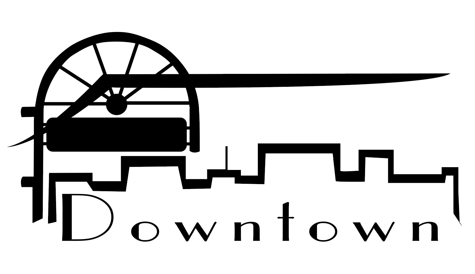
This logo has the Mesa, a downtown sign, and a skyline in addition to the word mark.
Does not work in only one color. Your logo MUST work in only one color because of the many applications in which you will want to use it. Logos work best in all white over photos or in vinyl on windows.
This logo depends on color to distinguish important elements. When used in one color applications, it loses these important distinctions.
Hard to Read or Pronounce. Obviously the name of your business will need to be chosen before any logo is designed, so that is the stage to think about how customers will read it. If your name is hard to pronounce, how about making up a unique name or using some identifier that anyone can read and pronounce right away? Then in the logo design process, choose colors that play well together and stay away from crazy and over stylized typefaces. Lastly, if you’re including a tagline, make this as succinct as possible – this is not the place for a paragraph describing your business.
This logo is in a hard-to-read font and also uses two high-contrast colors together creating a vibrating/non harmonious color scheme. Lastly, if your business name is hard to pronounce, you will want to pay extra attention to font choice.
Doesn’t scale well. Even if you’re only using your logo on a billboard, you will need to keep it simple. Billboards are passed quickly by drivers and from such a distance that, to your eye, they are relatively the same size as looking at a business card in your hand. If your logo looks good, is readable and doesn’t lose any elements at an inch and a half, then it will work in most any application.
This logo has lots of details that become indistinguishable when it is scaled down. Also, the ratio of the size of the largest text to the smallest is so much that the larger text will always need to be relatively large for the small text to be legible.
Looks like every other logo in your field. It’s easy to get stuck in your head about your own business. After-all, if you’re a chiropractor, it seems like there should be a spine in your logo, right? But step back and put yourself in the shoes of the public who are trying to choose you over your competitors. How can you stand out while still conveying what your business does?
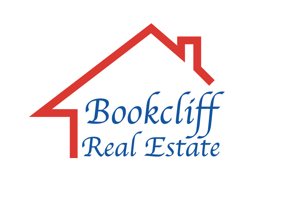
There is nothing unique about this logo. Like almost every other real estate business it features a house. It also has a name like half of the businesses in the Grand Valley, has very basic colors and a very common font.
Confusing. You can probably instantly recognize that stylized shape of a turbo next to your auto shop’s logo. But Aunt Suzie thinks it’s a hairdryer and Ned, the Zoologist thought it was a nautilus. What’s a better way to communicate to your client base what you do? Also, going back to number one, keep it simple. You may be tempted to add Independence Monument in addition to the turbo to show that you’re local in Grand Junction – oh yeah, and some wheels as well because you sell wheels at the shop too, but stick to one solid idea.
This logo’s font makes the word “Duck’s” read as “Duke’s”. Also, neither the name of the business, nor the image mark clue you in on what this business is. The image mark is ambiguous and leaves the consumer wondering what it even is. Finally, the circles lead the eye across, for no reason. They have nothing to do with the rest of the logo and are just as ambiguous as the other shape.
Markers of a Good Logo
Simple. Even the biggest brands out there sometimes make the mistake of overcomplicated logos. Verizon’s original logo had an oddly placed check mark above it and also had a stylized red “Z”. These two distinct marks split your attention and each had their own thing going on. A simple logo brings your eye to one specialized point in the logo.
This logo is very simple, the daisy in place of the dot of the “I” is the only idea happening. The center of the daisy gives a subtle hint to a fried egg and already you get the idea this is a breakfast place (and maybe now you’re getting hungry too).
2) Works in one color. As stated above, you’re going to want your logo to appear on a variety of surfaces, from glass cups and office doors to embroidered shirts and leather patches. Many of these application will call for the logo to be in one color.
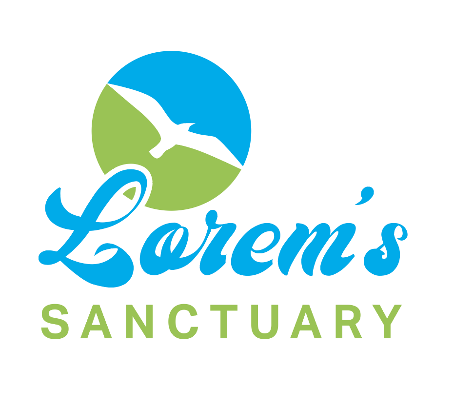
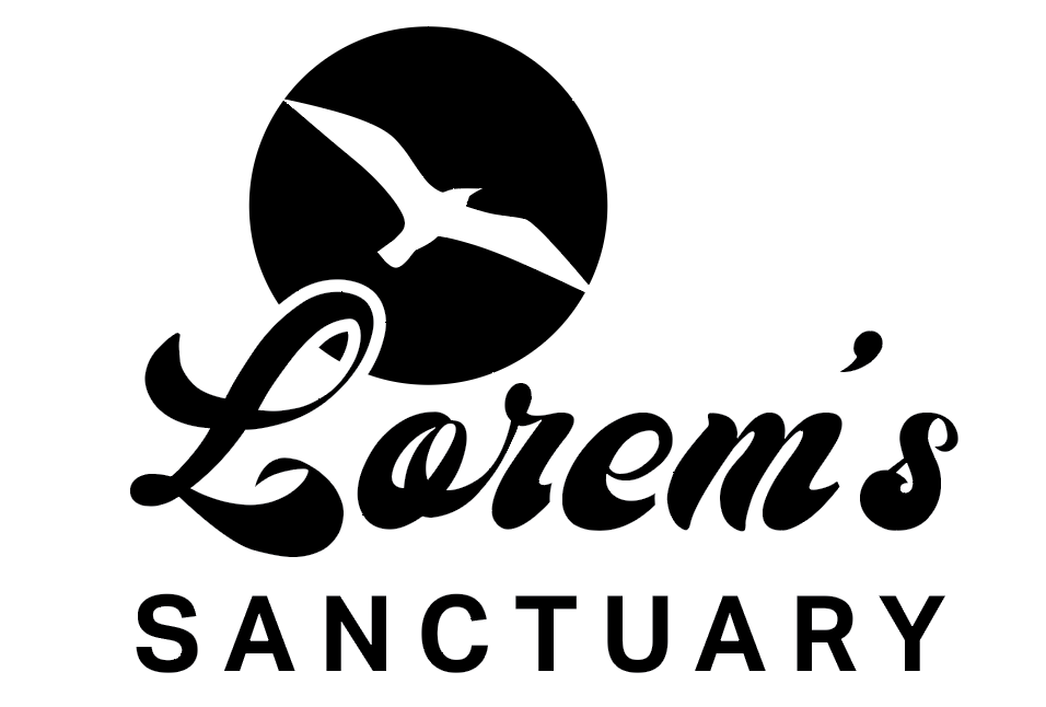
Because the bird cuts through the circle, this logo would work well in one color. If the bird was located somewhere inside the circle, the color would have nothing to separate them and an alternate version of the logo would need to be created. Also, since there is a stroke on the “L”, where it overlaps the circle , it can be separated from the background.
3) Readable/Pronounceable. Bold typefaces and high contrasted backgrounds and foregrounds can quickly grab the attention you’re looking for. Leave the small script or decorative fonts for some pretty little social media post – your logo needs to be instantly legible.
Big bold text that contrasts everything around it makes this logo easy to read. Also, the colors don’t fight with each other.
4) Scales well. All elements in a logo should be relatively proportional. Even the thin parts of the font should hold up when the logo is shrunk very small. Many businesses choose to have their logo on pens and if your logo doesn’t scale well, it will not read well on the barrel of a pen.
When this logo is scaled way down, it is still readable and all elements are still decipherable.
5) Unique. Most businesses have competition and we know you want to stand out above them all. Before the public sees that your service is the best in the Valley, they are likely going to judge you by their first impression and that usually comes from your logo. Brainstorm about imagery that can still depict what your company does, but isn’t the same colors and images every one of your competitors is using.
Every dentistry logo out there features some stylized tooth. Think outside the box to make your logo stand out.
6) Communicates Who You Are (including font choice).
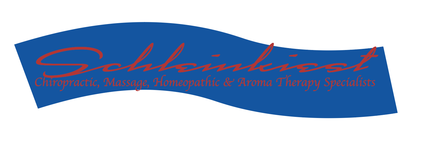
A light delicate font isn’t going to communicate the big machinery and hard working environments of an oilfield business. In the same way, bold heavy fonts don’t communicate the lightness or care of a massage therapist. Furthermore, if you have an image mark as part of the logo, be sure it clearly conveys the business. You may see the connection a prickly pear cactus has to your doughnut shop, but to the hungry breakfast seeker, that isn’t going promise what they’re looking for.
This logo represents a bookseller and immediately communicates that to the consumer. The book illustration directly relates and isn’t ambiguous.
Need a logo? Mereg2Media is your one stop shop to have a complete, custom designed logo just for your business. Need your logo updated? If you read this list of pitfalls to avoid and find your logo could use a little help, we’re here for you! In either case, we will work closely with you to finalize a logo that is unique and brings attention to your business and something you can be proud to reproduce on giant billboards, shirts, hats, cards, your website or whatever you can imagine. Have a great logo already? Talk with us about building your brand by getting your logo out there on hoodies, banners, windows or even on bottle openers, cups, pens, or socks!
If you come to Merge2Media with logos to be printed or similar graphic artwork, you will likely be asked if you could provide us with a vector file of the artwork. To quickly identify whether you have that file type, look for one of these extensions: .ai, .eps, .svg or .pdf. If your image is in any other file format, we may be able to use it in some situations if the resolution is high enough or sometimes we can even use our software to convert it to a vector but this option will never give you the highest quality output.
We are aware that this file type isn’t common and that you may not have access to the original creator of your logo to provide it for you. So let us explain why we need this format and how you can help us get the right file.
Raster
The best way to understand vector art is to compare it to the more common image file types you’re probably more familiar with like .jpegs or .pngs. These other formats are raster based images, meaning they are built up of thousands and millions of pixels. Pixels enable an image to display all the colors we see and to blend them seamlessly and therefore are best for photographic images.
The problem with raster images is that when we scale them up, even high resolution photos start to show the pixilation.
Vector
Vector images, on the other hand, are created using mathematical equations between points to measure distances and shapes. Because of this, their size can be increased indefinitely as the computer simply multiplies these equations.These file types work best with logos and graphic styled illustrations.
Since every part of the image is editable, vector images can be recolored, repeated and shaped as needed in addition to being fully scalable and are independent of a background. This enables us to manipulate the logo for any of the many various applications available, from t-shirts and hats to signs, stickers, banners or whatever you can imagine!
How You Can Get Your Artwork in Vector Format
Whoever originally designed your logo likely started with vector and so, if possible, contact the creator to see if they can send it to you. If you can’t get that file, there are two things we can try to convert your artwork to vector. One is to use our software to try and trace the artwork. This can be a great solution if your original picture is high resolution. Lastly, we can try and recreate your logo. This method is the most labor intensive and depends a lot on the availability of the fonts used in your logo and how complicated your logo is.
We enjoy finding ways to provide the best output possible for your project, and hope this helps!
This post is about the various projects I have built that are a bit outside of my “wheelhouse” of 2D drawing; anything from sculpture to woodwork, etc.
Clay sculpture of my rabbit “Carrot”. I think I did this in 8th grade.
Carrot and Ruf clock. (2001)
Self portrait clay sculpture (1998 or 99)
Dragon Incense Holder. Whittled with a Dremel Tool. (Sometime in the late 1990s)
“Cooper”, Marionette Puppet. Head, hands and feet whittled with a Dremel Tool. (Sometime around 2000 to 2003)
“Universal Void” plaster of Paris sculpture. (1998 or 99)
At my house we started using pieces of scratch paper held on the fridge by magnets as our grocery lists. Being an entire letter sized sheet, a grocery list down the left side leaves ample space on the right for some fun doodles. So, lately I have been sitting down with my boys (3 and 4 years old) when they are drawing and asking them what they want me to draw. Here are the results:
Bugs Bunny (obviously)“Alien” the Super Hero EelThe boys asked for me to draw them and their sister in a rocket.Jeddy says “Draw me and Judah slurping the whole world!” Judah says “Draw mine sissors!” “Dad, draw the goofiest horse ever! And make him weird and spooky!” they said.
The boys wanted me to draw a dragon who was cooking his cheese with his fiery breath. Shelly was making bone broth at the time and so they had me name him Bonebroth the Dragon.
The boys wanted me to draw Bonebroth’s mom and they wanted her cooking a pot of broccoli and holding a quesadilla. Jeddy wanted the end of her tail to be a heart and for her to be purple. Judah named her “Seagoes”
Judah (my 3 year old) asked me to draw a baby climbing up the clock and then wanted that baby to be his sister. Then my 4 year old, Jeddy, drew his version (left)Judah wanted me to draw a ladybug.
In 1995 I was 16 and I had an idea: Whenever I woke up and remembered what I dreamed that night, I would write it down immediately (if you don’t do it immediately it disappears from memory pretty quickly).
I can’t remember what sparked the idea (something, I think, on MySpace) to make paintings of my dreams. This idea was totally feasible since I had already written down probably more than a hundred of them. I love this idea because I have always been fascinated by dreams – this other world we live in where our brain makes up these bizarre stories. It’s like your brain is constantly creating new stuff and this was a way to catch these dreams. I also wanted to get practice with oil painting since it is admittedly one of my weakest points in art media. This is why I chose to make them small (these are each 8×10″ oils) Enjoy!
Dream Series #1 – “Chasing Courtney” 8×10 Oil, 2006
3-29-95 Last night I had two dreams. In the first one I was with a group of people, I don’t know who. We were in the mountains and we were water skiing- up a stream with no boat. Then somehow I was in an indoor pool – with the skis I think. I was looking down at people swimming and I saw Courtney, she glanced up at me but continued chasing Scott Kitchen. I was sad because she only glanced at me. Then I was off the skis and under water – it wasn’t hard holding my breath. That’s all I can remember, then I was just sleeping until the second dream. I’m not sure if this is how it starts, but I was in the yard-a yard-not ours-and I saw some trash blowing around. It looked like dad’s mail. Then I asked Ricky Chase who was standing there, why had he read my letter? He said “Because I wanted to know the inside word”, he said sadly. Then he started walking up the street in front of our house. I then went inside to find the letter. In my room was an open box. Inside it was a couple of books, some pictures and the letter. I glanced at the letter but took out a phone that was in the box [some how I was suddenly in mom & dad’s room] The phone had two sets of buttons, only one had numbers on it. It had and on & off button and a hang up button. I thought “I’ll call Courtney on this phone”. All the sudden it was like I had just waken up- I was back in my room and I was about to take the letter out of the box. I couldn’t seem to completely wake up. I kept shaking my head. Then I really did wake up. I was still anxious to-to…what? What was I just thinking about? Courtney! Courtney! Oh, the letter. I looked down to my desk and saw the Lamborghini I drew last night-no box-no letter! There was one more thing-somewhere in that dream, I was on our basket ball court with Courtney and for some reason she was crying so I hugged her. It was so real.
End
Dream Series #2 “Ending in Fire” 8×10 Oil, 2006
3-30-95 I had two dreams again last night. All I can remember about the first one was that Adrienne wanted to play football. Me, Wes, Aric and Adrienne were up at the high school practice field with others who were going to play football. Adrienne was arguing with Aric about a college football player. Adrienne knew more than I did! Well, that’s all in the first one. In the second one, I don’t know how we got there but me, Wes, Aric and I think Adrienne were on a trail at night. The trail cliffed off at the sides. I can’t remember anything beyond the side of the trail – bushes? Just darkness. Then at the end of the trail there was the Pentagon? The four of us did something there I can’t remember. The sun was out but it was still dark. Suddenly it was like a flare reached out from the sun to where we were and everything was on fire. We started hauling butt down the other way on the trail. The fire seemed to chase us. Aric and Wes got ahead of me because I was looking back at-I was sure now, this girl wasn’t Adrienne she had blond hair? – the girl. She was crying because she couldn’t keep up with us. I slowed down and crouched and said “Piggy Back”. She jumped on my back and I ran to where Aric and Wes were. I remember as we ran I said “When God comes, He is going to destroy the world in fire!” We all started praying out loud. Then we went underground, safe from the fire. I can’t remember how, it was an elevator I think. We were inside a Public place and we ran to a room. Mom was in the room sitting on a bed. “Are you back from sewing pennies at the Pentagon?” she asked. And that’s all I remember.
End
Dream Series #3 “Keep Your Bible” 8×10 Oil, 2007
4-3-95 I don’t think I can remember everything about my dreams last night or all of them. All I can remember about the first one is that I was on the west side of a white trailer house out in the country. The field it was in had tall weed/grass like the stuff out in the alley. It was a cloudy day and I was looking west at a swing set. I can’t remember much about the second either. I was at the City Market parking lot. Aric walked away from me and put his Bible in the trash can and then he got into a little car -a red 4 cylinder – in the back seat. I went to the trash can and took out his Bible and went to the car and laid it on the front seat in front of him, his mom was in the driver’s seat. That’s all.
The End
Dream Series #4 “Yeller Truck” 8×10 Oil, 2010
4-7-95 Last night I dreamt I was in Aric’s truck with him and Jason Moyer. “Jaime is a good dog. Do you know who Jaime is Josh?” asked Aric. “Yeah, Lil’ Woof!” I said. “Yeah,” Aric said. Then I looked at my old watch that is about to break and I said “This watch ain’t no stooge” Aric and Jason agreed with me. And that’s all.
The End
Dream Series #5 “In the Wake of Advancement” 8×10 Oil, 2011
4-8-95 My first dream last night, I was here in Craig. I think Craig had some bigger buildings. It seems like I was over at that parking garage behind Ben’s mom’s hair cutting place (in that area) There was an old motel there. It was like each room was a separate little building. This motel really seemed real. I remember talking to mom there. I was thinking about that motel. A business man came from out of town and painted it blue. everyone was happy because he was going to fix up the place but as soon as he painted he left. Then another guy came and painted it white and had it running for a while. But now, as I stood there, the place was run down. Windows were broken. The paint was chipping. There was trash and junk and weeds all around. Then I looked up into the sky [it was twilight, it was almost night] I saw what looked like a giant sign/billboard flying in an arc from west to east. It had an advertisement on it. It was very normal to me. ….. Then I remember being in a motel room [different than the one I just explained] There was a dime sized hole in the floor. Wes was looking in it and laughing. I looked in to see the room below us’ TV Then I looked back and saw a couple of people. Me and Wes thought it was cool because we could see them but they couldn’t see us. ….. Then I was at some sort of park. [It seemed a little bit like the city park] and I had my right shoe off. I was looking at the swollen spot on my toe [There is a swollen spot on my big toe in real life right now] I was digging at it and I got something out. ….Then I was riding something – I don’t know what because it was something small and all behind me. The control was like an R.C. control. It had a button for forward and a button for stop/brake. I remember zoomin’ along the street about North Central Craig (about where Paula’s house is) I wasn’t able to stop it real quick. I tried to stop at a stop sign but ended up out in the middle of the street passed it and a car had to stop for me. I started to go up hill to the left [east]. When a truck came out at me. I turned off the road and went down a little dirt hill. …. Somewhere in all the dreams [I’m not sure if they’re all in order] I remember sitting in the back seat of the Ripkoski’s Toyota Camry/Corolla. I remember it was smaller/less knee space in the back seat than our Renault.
The End
Dream Series #6 “Late for Supper” 8×10 Oil, 2013
4-9-95 I dreamt last night that me, Wes and Aric were drawing on top of the shed with crayons. It was night. The shed was on the post that marks the north border of me & Wes’ area. We didn’t have the back porch. Mom was looking out through the kitchen window. She was yelling because we were late for supper. When we came inside, Aric was gone and we went into the new room. I think mom was asleep. Then fire came out of the first joint in the chimney. Flames caught on our newspaper stack and some other things. I ran as fast as I could into my room and got my squirt bottle. I ran into the kitchen and filled it up then ran back in there and squirted the fire. …… Then I was in the New Room still, but there was no fire or anything. Dad was sitting in Mom’s chair. I was sitting on the south end of the coffee table looking at Dad’s Sunday School book. “Did you read that?” he asked. “No” I said. Then Dad asked “Where are you guys at in your Sunday School books?” I don’t remember what I said. “So tell me about it” he said. Then that’s all I remember. [somewhere in there I remember tearing up my ski pants]
The End
I really like the idea of this series but, as you can tell by the dates, I have really struggled finding the time to do them. I have decided that I’m not enough of an oil enthusiast to put up with the cost and hassles of the materials and cleanup and so I probably won’t keep going with oils. If I continue this series, it will probably be in another medium.
Several months ago I answered a call for artists put out by the City of Grand Junction Commission on Arts & Culture for a project called “Electric Art”. This was Grand Junction’s title for having Traffic Signal Boxes (TSBs) around the area painted by local artists. This has become somewhat of a trend in many cities around the world. Though they didn’t mention it, I believe the purpose is to cut down illegal graffiti and the cost of cleaning it up.
My life as a full-time graphic artist and husband and father leaves me little to no extra time and when I read how thorough the application was I almost dismissed it. However, the prize money, $1500, was enough to make me push through. In addition to a resume, 5 samples of previous similar art projects, 2 references and a detailed description, they asked for a scale model to be painted of the artist’s idea. Just finding the time to paint and construct the model was very hard but I squeezed out a little masterpiece for consideration.
The stipulations were many and including having to reflect local scenery or activities or something, needing to be lighter colors and having to wrap around the TSB.
My idea was to do some of the animals that can be found around here in my cartoon style. The background is of the major landmarks here: Mt. Garfield, The Grand Mesa and the Colorado National Monument. Here is the model I turned in:
Turkey vultures can be seen flying and big horn sheep hiking around the Colorado National Monument. There are wild mustangs that roam around Mt. Garfield and the Bookcliffs and there’s a small moose population on the Grand Mesa.
I was surprised when I got the call that my design was one of the two chosen by the Horizon Drive Improvement District to be painted at Horizon Drive and Horizon Court. They announced the project on the city blog: https://gjcitynews.org/2019/04/11/horizon-drive-to-receive-new-artwork/
I had some hurdles to jump including buying General Liability Insurance and buying some very expensive paints, primer and varnish (that all cuts into the award money). I began the project on May 1st by applying the first coat of primer.
Although the can says this primer will cover 450 sq. ft. and I figured my box to be a little over 61 sq. ft., I used an entire quart for coat number 1.
It looks pretty ugly at this stage.
On May 2nd I went out after work again to apply the second coat of primer. Still looking pretty ugly, a passersby probably wonders what in the world I plan on doing to that thing.
2nd coat of primer.
Friday May 3rd was day 3 and again I headed over after work. My only goal that evening was to sketch out the design.
I wasn’t sure what would be the best tool for sketching on primer. A graphite stick worked perfect.
Saturday, May 4th was the only full day I had to work on the painting and I planned and hoped to block the lion’s share of the color in.
I started around 9:30am or so.
I worked until about 5:00 or so on Saturday.
As planned I was able to block in the landscape by the time I called it quits on Saturday.
Throughout the day I learned so much about outdoor mural type painting. One was that going to the bathroom is really hard because I had to walk a half a block our so to a hotel lobby and so I had to leave all of my stuff out there unattended. I also learned that, as I had suspected I didn’t have enough paint. We were required to use Gold brand heavy bond acrylics which come in 4.5 oz tubes that cost between $20 and $32 each and I had to make a run at lunch for more paint. Another thing I learned about painting outside is even a slight breeze will quickly dry your paints (at least on the surface). I was continually dipping my brush in water (if I ever do this again I will definitely invest in some Extender) At some point someone from the GJ Commission on the Arts came out to post my progress on their Facebook page.
Also I believe it was this day that a guy asked me some questions and said his friend that works at local radio station KEKB was always looking for stories and then I saw this pop up in my Facebook feed WHO’S RESPONSIBLE FOR PAINTING ROADSIDE FIXTURES ON HORIZON DRIVE?
After church on Sunday, May 5th, I headed out about noon to block in my animal characters.
My sweet wifey and boys dropped by for a surprise visit and brought me a Freddie’s shake!
I finished up Sunday near 6pm
Monday, May 6th, was the day to do the outlines. This is when a piece like this really turns the corner and starts looking the way it should.
From a distance
Outlines are the funnest to me because its most like inking which is the type of art I usually do.
I put in around 3 hours Monday night.
Outlining is fun but delicate work. I had to hold my breath with each stroke to get the smoothest line. As a note, please don’t honk at someone doing a mural! Even with my earbuds in this startled me and almost made me screw up a line. After the lines, I added my name, email and website. Another thing required for this project is to paint the concrete base. Luckily I was allowed to use a cheaper paint, and brushing it on with a roller was pretty fast.
The final day, Tuesday May 7th I just had to do one more thing the Arts Commission required: a protective varnish. This stuff is really sticky and I would love to know how other artists deal with wind gusts while applying this. I think some small particles got stuck in my varnish but I was lucky to miss a dust devil about 5 minutes earlier that brought a tornado of elm seeds across my TSB, knocked my ladder over and blew one of my drop clothes to Oz.
In the end though, the varnish really finishes off the piece with a nice look!
I think the finished work looks pretty close to my model, don’t you?
Beside the various handles and vents getting in the way, I am pretty happy with the end result.
Hopefully my piece will last for years to come and get me some exposure while beautifying the area!
Addendum:
In March of 2020 I was notified that my box had been vandalized. Some jackwagon thinks its funny to make a mess of my art. I hope the cops get this guy (he vandalized Pavia Justinian’s box too)
In 2018 I was 39 and got word that my parents were going to have to put their 14 year old shih-tzu, Zeke down. Although he was both their dog, he was definitely more mom’s and she would stop at nothing to care for this dog. My poor mom was diagnosed with cancer (yet again) in October and with Zeke’s poor health, she knew there was no way for her to take care of him through her treatments and so the decision was made to put him down. It was for the better anyway as Zeke’s health had gotten so bad he really didn’t have a quality life anymore. What a time for mom to lose her little companion. In times like this you feel like there is just nothing you can do for someone grieving and so the least I could do was a memorial drawing for her.