[reposted from my work blog] Written by Josh Anderson on February 16, 2023. Posted in Education, Merge 2 Media, Merge2Media News.
Your brand plays a major role in why customers and potential customers choose you over your competition. Your logo is the face of your brand and can communicate, in an instant, your company’s qualities, mission and trustworthiness to those customers. Over time, the more you associate your business’ qualities with the logo, the more you can say with just your logo. With all of this being said, you can see just how much importance hangs on your logo. A well designed logo can be a vehicle for your message but a poorly designed logo can be confusing, hard to read or quickly forgotten.
Does Your Logo Make the Cut?
Here are some things to avoid with your logo:
- Too much detail (A logo is not an illustration). Be ruthless and refine your logo to the simplest idea you have.
- Does not work in only one color. Your logo MUST work in only one color because of the many applications in which you will want to use it. Logos work best in all white over photos or in vinyl on windows.
- Hard to Read or Pronounce. Obviously the name of your business will need to be chosen before any logo is designed, so that is the stage to think about how customers will read it. If your name is hard to pronounce, how about making up a unique name or using some identifier that anyone can read and pronounce right away? Then in the logo design process, choose colors that play well together and stay away from crazy and over stylized typefaces. Lastly, if you’re including a tagline, make this as succinct as possible – this is not the place for a paragraph describing your business.
- Doesn’t scale well. Even if you’re only using your logo on a billboard, you will need to keep it simple. Billboards are passed quickly by drivers and from such a distance that, to your eye, they are relatively the same size as looking at a business card in your hand. If your logo looks good, is readable and doesn’t lose any elements at an inch and a half, then it will work in most any application.
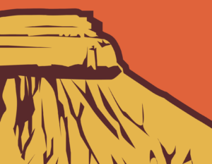
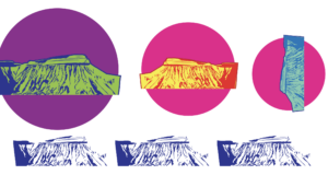
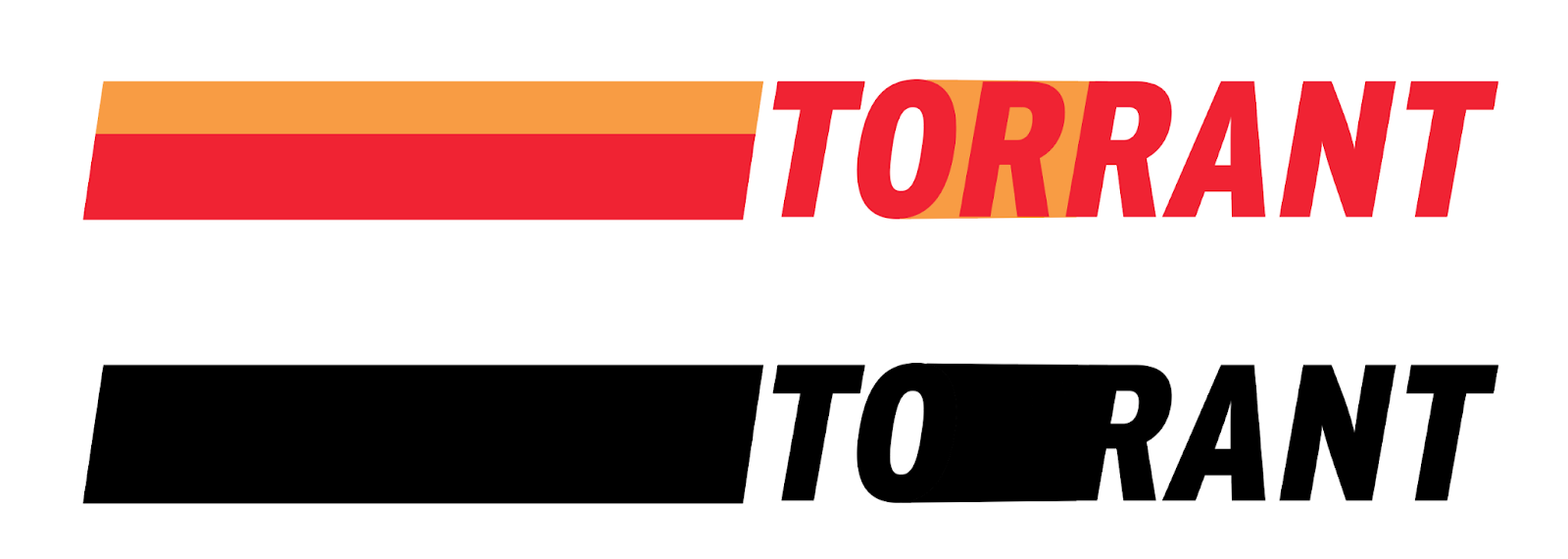
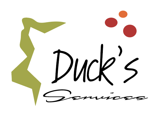
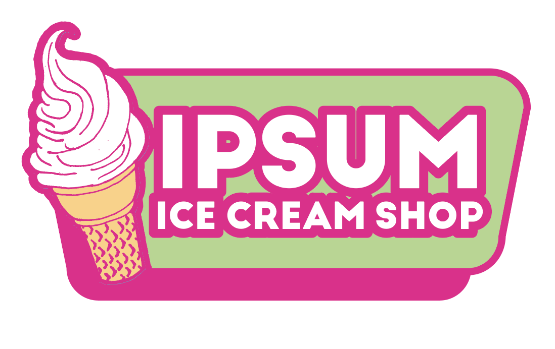
This logo has lots of details that become indistinguishable when it is scaled down. Also, the ratio of the size of the largest text to the smallest is so much that the larger text will always need to be relatively large for the small text to be legible.
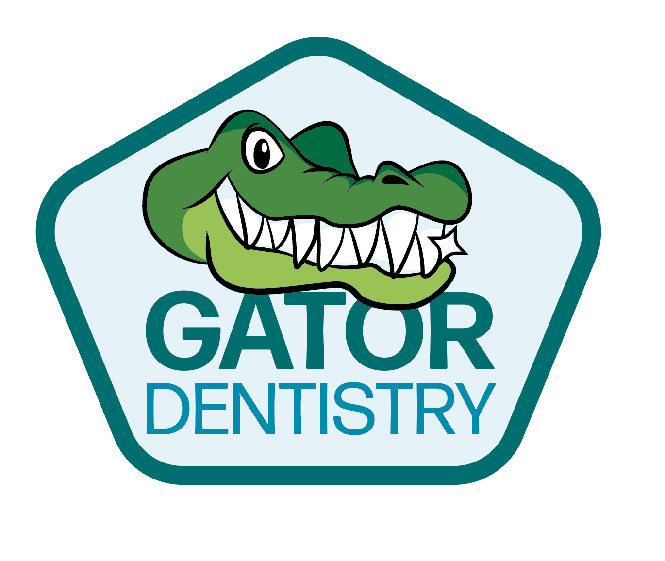
- Looks like every other logo in your field. It’s easy to get stuck in your head about your own business. After-all, if you’re a chiropractor, it seems like there should be a spine in your logo, right? But step back and put yourself in the shoes of the public who are trying to choose you over your competitors. How can you stand out while still conveying what your business does?
- Confusing. You can probably instantly recognize that stylized shape of a turbo next to your auto shop’s logo. But Aunt Suzie thinks it’s a hairdryer and Ned, the Zoologist thought it was a nautilus. What’s a better way to communicate to your client base what you do? Also, going back to number one, keep it simple. You may be tempted to add Independence Monument in addition to the turbo to show that you’re local in Grand Junction – oh yeah, and some wheels as well because you sell wheels at the shop too, but stick to one solid idea.
Markers of a Good Logo
- Simple. Even the biggest brands out there sometimes make the mistake of overcomplicated logos. Verizon’s original logo had an oddly placed check mark above it and also had a stylized red “Z”. These two distinct marks split your attention and each had their own thing going on. A simple logo brings your eye to one specialized point in the logo.
2) Works in one color. As stated above, you’re going to want your logo to appear on a variety of surfaces, from glass cups and office doors to embroidered shirts and leather patches. Many of these application will call for the logo to be in one color.
3) Readable/Pronounceable. Bold typefaces and high contrasted backgrounds and foregrounds can quickly grab the attention you’re looking for. Leave the small script or decorative fonts for some pretty little social media post – your logo needs to be instantly legible.
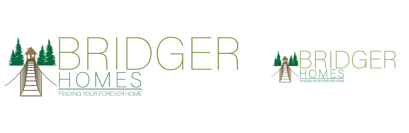
4) Scales well. All elements in a logo should be relatively proportional. Even the thin parts of the font should hold up when the logo is shrunk very small. Many businesses choose to have their logo on pens and if your logo doesn’t scale well, it will not read well on the barrel of a pen.
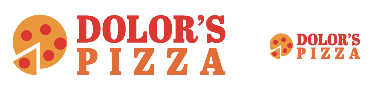
5) Unique. Most businesses have competition and we know you want to stand out above them all. Before the public sees that your service is the best in the Valley, they are likely going to judge you by their first impression and that usually comes from your logo. Brainstorm about imagery that can still depict what your company does, but isn’t the same colors and images every one of your competitors is using.
6) Communicates Who You Are (including font choice).
A light delicate font isn’t going to communicate the big machinery and hard working environments of an oilfield business. In the same way, bold heavy fonts don’t communicate the lightness or care of a massage therapist. Furthermore, if you have an image mark as part of the logo, be sure it clearly conveys the business. You may see the connection a prickly pear cactus has to your doughnut shop, but to the hungry breakfast seeker, that isn’t going promise what they’re looking for.

Need a logo? Mereg2Media is your one stop shop to have a complete, custom designed logo just for your business. Need your logo updated? If you read this list of pitfalls to avoid and find your logo could use a little help, we’re here for you! In either case, we will work closely with you to finalize a logo that is unique and brings attention to your business and something you can be proud to reproduce on giant billboards, shirts, hats, cards, your website or whatever you can imagine. Have a great logo already? Talk with us about building your brand by getting your logo out there on hoodies, banners, windows or even on bottle openers, cups, pens, or socks!